Thursday, January 31, 2013

Colours with Great Manners

Did you know that colours have good manners when in good company? It's true. Well, its not literally true but definitely it is whimsically true. Complementary colour schemes are colours that work well together because they are opposite each other on the colour wheel (and they are also colours that say nice things to each other like, 'My what a lovely hue you are today'...).

Complementary colours are usually the most dynamic scheme you can employ in a room because they are both equally intense and therefore challenge the eye for attention (but in a good way!).

Here's a fun little colour wheel chart showing the comraderie of each hue:

complementary colours

For our current project (the basement) I have decided to go with a colour scheme in the main room that relatively matches the upstairs (beige neutrals with cool blue accents) but plays well with the bright orange and grey of the adjacent music room. So, it has come to my attention that Navy and Mustard Yellow play very nice together!

Love navy with mustard yellow!

They are best friends. Their love affair only intensifies when you group them with a soft beige neutral to tone down the intensity.

for all my National Geographics that I can't bring myself to throw out

Like the picture above, I am planning to use a deeper navy as the main accent (think, one large wall and a great sectional) and the yellow as the secondary accent (maybe an upholstered ottoman? I DO have a lot of National Geographics I could shelve nicely).

What's your favourite polite colour duo?


Wednesday, January 23, 2013

Girly Girl (Nursery)

Remember the inspiration for the baby girl nursery? Aqua, coral, grey and...birds! I would want the girl's room to be soft and calming with hits of colour like a bright aqua chair and, of course, some reused bird cages from our wedding. I will also be using the Persian rug we bartered for in Dubai as my jumping off point.

Okay, here she is in all her glory:

Baby Bird Nursery

Ain't she purdy? Let's get the run down:

1-Tree branch mobile--DIY
Is it weird that I have already collected a few perfectly sized and weathered branches for this project? Is it even weirder that I did this in the summer, well before I was pregnant? Counting my chickens perhaps? Not really, I had the idea when I was helping a friend design her nursery for her little girl and the project never really worked with her scheme but I decided to keep the sticks....just in case....This DIY tutorial from designsponge.com shows ya how.

2-My Perfect Garden Mixed Media Print--Valerie Lorimer
I would love to get something like this in an 8X10 and then use it as the focal point of a gallery wall behind the crib. Aren't the colours perfect? Not to mention those birds!

3- Marrakech Cutrain Panels--Anthropologie
These would also brake the budget bank but they fit so perfectly with the scheme, how could I resist? I might try to find a similar fabric and make some of my own.

4-Hemnes Dresser--Ikea
This is the same dresser as the painted teal one from the boy's nursery. Basically I want furniture that is not 'kid' designed and will transition through the years with the child. Since the room is small I won't be using a separate change table and so I need a dresser that is low but wide to fit a changing pad on top.

5-Springtme Birdie Bedding--Skip Hop
Again, bumperless crib bedding is shamefully hard to find but this cute pattern from Skip Hop works really well with the theme and the colors of the room! Good job, Skip Hop!

6-Babyletto Hudson Crib--Target
I'm reusing from the boy's moodboard again, but I like to stick with what works....plus if we happen to have one of each gender down the line, I will be reusing things like the crib and dresser. Basically this crib has everything I would want in a crib: modern clean lines, soft, non toxic paint colour, solid wood design and it looks a lot like my crush crib from Ouef.

7-Rockabye Grande Glider--Target
I am totally smitten with this glider from Rockabye Glider Co. An expensive, coloured glider might not be in the budget but I could also recover something that I find secondhand. This one from ramblingrenovators.com is a great example of loads of style on the cheap!

8-Let There Be Flight Hanging Lamp--ModCloth
I love this idea but don't love that it is actually a swag lamp and not a ceiling fixture...wouldn't work in our room but I could take the idea and use one of the aforementioned bird cages I have from our wedding to turn into a ceiling light. I found these great plans online, again, from designsponge.com


Tuesday, January 22, 2013

Boy oh Boy (Nursery)

The last post showed my ideas and inspiration for the eventual nursery so now I want to share my actual mood boards for each possibility.

Oh boy! Remember that I want the boy's room to be bright, vibrant and animal (specially lion) themed in a subtle way. Here he is (rrraarrr!):

Lion Cub Nursery

1- Blabla Dream Lion Ring--Layla Grayce 
This is an adorable mobile option but fairly pricey for what it is. I might try to DIY something similar. I love the colours though.

2- Babyletto Hudson Crib--Target
I really want the crib to be modern and clean lined. This grey option is perfect as it converts to a toddler bed, is solid wood and uses non toxic paint.

3-Alphabet Zoo Crib Bedding--Skip Hop
Since bumpers are out due to safety reasons (plus I like the look of just a fitted mattress) I find it odd how difficult it is to find bumperless bedding...what's up? Skip Hop has a great line of options and they are super cute!

4-Take Me For A Walk--Sarah Jane Studios
I first saw this adorable print used in the nursery over at the great Canadian blog aubreyandlindsay.blogspot.com and it fits the lion theme perfectly!

5-Premier Prints--Fabrics.com
I want to incorporate a lot of the colour palette in the accessories and since it might be hard to find the perfect teal, grey and orange fabirc I will probably enlist the wicked sewing skills of my own mama to make some curtains and a pouf out of these funky prints.

6-Hemnes Dresser--Ikea
Ultimately I want to get a used dresser off of Kijiji or some other great second hand find and paint it a strong teal to match the room. This Ikea hack is a great example of incorporating colour (from eliseblaha's blog) in furniture.

7-Lion NightLight--Jonathan Adler
I LOVE everything J.A. does so I couldn't help incorporating just a little something from his ceramic collection.

8-Crown Reclining Swivel Glider--Target
The biggest baby gear advice I have gotten from my mom friends has been to buy a comfy rocker since you spend most of your time cuddling and feeding that baby so I would love to have something like this pistachio coloured one!

9-Forest End Table--Target
This is a direct homage to Jenny from anythingpretty.com and her great idea to use an old tree stump as an end table. My father-in-law happens to not only have a huge wood pile on his property but also a great talent for working with unique material (he made our cupcake stand out of cut logs for our DIY wedding) so I will either enlist his help or.....buy this one from target!

10-Table Lamp--Bouclair
I just love Bouclair for their cheap and cheery lamps. This one works great in this scheme!

11-Richmond Wool Tufted Area Rug--Target
Modern, colourful and made of natural fiber = perfect!

So there you have it! The boy's nursery all kitted out.....will it come to fruition? 


Saturday, January 19, 2013

Baby, Reveal Yourself!

I am currently starting 18 weeks of being knocked up and very soon this baby is going to reveal itself (here's hoping his/her legs aren't crossed at the 20 week ultrasound). My husband and I can't wait to find out the gender. We keep talking to my belly and saying our patented tagline: "baby, reveal yourself"...in a cheesy magician voice. So while we don't know whether we need to plan a nursery full of sugar and spice or slugs and snails (boys really get the bad rhymes in that poem) I thought it would be fun to show you what my dream nursery would look like for a boy and for a girl.

First, up: boy (since I feel bad about the negative imagery of their rhyme). I think of a boy's nursery as very bright and vibrant. My husband and I both are big animal lovers and for some reason, ever since I found out I am pregnant, my hubby has wanted to decorate the (potential) boy's nursery with a lion theme. While I hate 'themes' per say that are too overdone (the current owl theme in nursery design has totally jumped the shark), I do love subtle hints to an overall unifying feel (very pretentious of me, I know).

I have always loved this nursery from anythingpretty.com. Seriously, follow the link in the caption for the whole room including a look at that fabulous window bench with those killer DIY built in shelves.

completed nursery
http://www.anythingpretty.com/2011/07/nursery-reveal.html


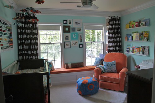
This pic is a little underexposed but I love the colour scheme anyway. The bright aqua walls mixed with the orange glider and hints of dark brown in the funky elephant curtains and mod furniture....love! It has an animal/zoo theme without going overboard. 

I also love the vibrancy of this little nursery that I first saw a few years ago on the great HGTV.ca program 'Pure Design' hosted by Samantha Pynn:

Mod yellow and orange nursery
Samantha Pynn

Of course, that Oeuf modular shelving is to die for (meaning a price tag that would probably kill my husband) and again, there is a subtle zoo theme in the wallpaper silhouette animals that are on the wall behind the crib. Genius!

Okay, now on to the girl's room! We (very) recently got married and after picking a venue up at a lodge in northern Ontario, we decided to match the place's rustic feel and have our wedding 'theme' be a "rustic-chic affair". That too is quite an overdone wedding theme thesedays so I decided to uniquify (that's a word) it by adding the imagery of 'love birds' to the day. We did it in various ways, including having birds on our invitations, bird cages as our center pieces and two wooden carved kissing love birds as our cake toppers. Again, not too much, but enough to covey the idea. Our colours were my favourites: aqua, pale green and warm brown. Here's a few shots of details so you can get an idea:


Our wedding was small and we DIY'ed most of the decor so we didn't spend a fortune on the details, but I loved it all so much that I really want to reuse it somehow (other than in my Easter vignettes--those birdcages scream Spring!). So, I thought what better way than in a little girl's nursery. The room is already painted a light peach colour to match a persian rug that we bought when we were living in Dubai (which, just happens to have two kissing birds on it!)


I want to keep this rug in the room and I still like the peachy colour mixed with grey and aqua (to match the wedding decorations). So in that vein, I found this beautiful and tranquil nursery at ontobaby.com

Soft Peach and Gray Nursery
http://www.ontobaby.com/2012/01/rylees-soft-peach-and-gray-nursery/

Absolutely beautiful! So soft and calming. I love pretty much everything, from those tissue paper pompoms to that stately wing-backed rocking chair. I also really love the colour palette of muted peach and grey.

However, the furniture is a little too precious for my tastes as I tend toward the more modern. And there is no aqua anywhere so I also found this lovely room on houseofturquoise.com and it ticked all the blue boxes for me!


http://www.houseofturquoise.com/2011/02/vivis-aqua-and-coral-nursery.html
It even had a slight bird theme with that great bird cage note card board!

http://www.houseofturquoise.com/2011/02/vivis-aqua-and-coral-nursery.html

I love the mix of grey, coral and aqua and the hints of black are very unexpected.

So that is where we are in terms of inspiration so far. Check back soon for a mood board post...I have been polyvoring up a storm (as evidenced by the unfortunate automatic posts that polyvore uploaded to the blog yesterday!). 


Monday, January 14, 2013

Welcome to My Boudoir!

On top of starting this blog, renovating our basement, getting my business in order to launch and growing a human being, (and doing all the other daily activities in life like laundry and dog walks and swiffering our dark brown floors from all the dog hair about twice a day and...oh yeah, working to make the benjamins) I am also in the midst of an interior design program in hopes of becoming professionally designated one (glorious) day. The program I chose is an online design program so I can work from home and at my own pace. So far, so good! I actually enrolled in the course back in the fall but found myself working two jobs instead of my usual one (part-time) job and also in the battle for my food and general sanity against morning sickness in my first trimester. Let me tell you, that comical vomiting that you see pregnant woman do on TV shows as an indication that they are knocked up is not at all funny when you are going through it yourself. It hit me like a ton of bricks and there were weeks when I threw up twice a day everyday and wanted to stay in bed (and therefore unconscious to the urges of nausea) for the whole afternoon!

There you have it, my feeble excuse as to why I am not as far along in my design course as I should be. I am actually only now doing the first unit. So I thought I would share my various projects and assignments as I complete them. Not the whole lesson (I don't want to torture you with readings and handouts) but my inspirations and thoughts on the assignments themselves.

That brings me to the first exercise which is to start a designer's journal about redesigning a bedroom. I actually want to redecorate my bedroom, so this was great timing! Our current master bedroom is lovely, don't get me wrong, but I am tired of it. Since the three years ago that we did it (and the 4 years ago that I bought the furniture for it) my design tastes have changed and I no longer want the intensity of colours or the blandness of the accessories. I also loath the white bedding which gets so dirty so easily since my husband doesn't mind if he sleeps on top of it with his drywall dust covered clothes for a nap!

Here's the bedroom after we painted and put the floor down, but before we moved any furniture in:


(all of my before shots are covered in floating dust particles)

Bright eh? Yeah, that was everyone's reaction at our paint party when we started in this room (which was the first room). My father in law called me crazy and said I would never stick with it. Well, he was half right. I am crazy. But I did stick with it for this whole time and probably a little bit more to come.

Then we started moving the furniture into it with the help of some burly men:


That dresser weighs A LOT! They were pretty pleased with themselves when they were finally able to set it down in the right spot:


Then it was time for the fun part. The decorating. Here is the whole room as it stands today:


I like it still, don't get me wrong, but there are elements I really want to change. The bedding: no more white. The wall decals: too overdone. When I bought them, wall stickers were fairly rare and still a unique alternative to wallpaper and these babies matched the motif on the bedding so well that I couldn't pass them up. However, now you can find wall decals everywhere! They are even at the dollarstore for crying out loud! They have to go! I want a headboard---aka: a real bed. But I will be DIYing one for sure.


Here's another angle so you can see the nightstands that I want to keep. They are from Pier 1 and they are totally unique and I still love their colour and style so they are staying!

So that brings us to my design journal. I want to create a relaxed yet spirited bedroom styled with modern accents and a mix of both calm colours and visual enticing accents. The walls, bedding and window treatments would be a subdued palette of greige (a grey/beige mix) and soft sage green (for the night stands!). The accents and accessories would be a step brighter and pattern would be introduced in the headboard upholstery. The room would make me feel calm yet cheery. 

Here's the inspiration board:

Green and Greige Bedroom
 Clockwise from left:

1. Ocean Mosaic Mirror--Pier 1
2. Teal Honeycomb Lamp--Pier 1
3. Throw Cushions--Bouclair
4. KAS Bluebird Upholstery Fabric--Joann Fabircs
5. Broxburn White--Benjamin Moore Paint
6. Beige Shag Rug--Target
7. Kylie Minogue Duvet Set--Sears
8. Citrine Stripe Throw--Pier 1
9. Bamboo Roll Up Blind--Bouclair
10. Contempo Window Panel--Pier 1
What do ya' think?


Wednesday, January 9, 2013

Making Sweet Music Part 2

As promised here is part 2 of the saga of the music room (although it is still not nearly finished, it is slowly cooking in its own juices). For a design scheme, I decided that a music room, and especially a music room for quasi-self confessed hipsters such as ourselves, screamed out for retro mid century decor. I have always loved bold colours and do not shy away from the bright whatsoever. I have also always loved orange (my father is a ginger haired handsome devil) however being the pale skinned raven that I am, I figured that since I can't wear orange, I can always force my walls to wear it and like it!

Then I thought, what better foil to orange than my favourite neutral, grey, and since we just happened to already own a very comfy chaise lounger and chair in dove grey, throw in a few orange filing cabinets from my university days and a pop of navy from a Pier 1 castaway armoir we found and voila, a colour palette was born!

orange and grey colour scheme

You can see from the inspiration shot above that when I said orange, I meant Orange (with a capital O, if you didn't get that). I also have desperately wanted to incorporate wallpaper into a room since we moved in, and since my husband (and everyone else I have ever talked to) nixed my idea to wallpaper the risers of my stairs, I thought, why not wallpaper the backs of the open shelving flanking the closet, like in this pic:

for the back of the built-ins

However, I wanted to use some of that bright orange to play up my colour scheme. Something more like this:


isak wallpaper

I would also take that cleaned lined teak armchair in a second!

Eventually after some searching for the perfect orange, retro wallpaper I found this lovely pattern from The Wallpaper Company and I thought to myself, 'oh yes, you will do quite nicely':

The grey was a perfect match to the furniture, the orange was called 'radiant orange' (so you know it had to be good) and the pattern was definitely retro. I then decided that since our plan was to essentially plaster the walls with framed silk screened music posters from concerts we have been to, then the rest of the paint should be as neutral as possible. In that vein, I pulled the ecru colour from the background of the wallpaper to paint the rest of the room. Here is the room as it currently stands (in horrible disarray and general messiness):


I feel that the ecru is too...ummm....ecru-y? I think it looks like drywall mixed with ceiling primer (I think that because when we painted it you couldn't tell which drywall had been painted and which had not and you definitely couldn't differentiate between the ceiling and the walls!). I'm thinking of going in a lighter grey feel to still keep it neutral but add at least sum'in!

Anyway, beside the hideous mess in this room, I will point out that the bright orange is only on the closet frame:


And a vintage credenza with......wait for it.....a built-in record player! Oh yeah!


We stole/took from his junk pile this particular piece from my husband's grandfather. A spray of bright orange, and it looks like a million 1960's bucks! (which, if you calculate inflation, probably equals 75 cents today). We have already built in the necessary wiring to mount a tv above this bad boy like in this pic:

layout

So there you have it. The music room in progress. Can't wait to play a session of Rockband down there soon!

Tuesday, January 8, 2013

Making Sweet Music Part 1

Yes, we have actually pretty much 'done' all of the upstairs of our cozy little raised ranch (minus the filling of the nail holes in ALL the trim--which is my shameful secret) but since we are completely basement-centric these days, I thought sharing the progress thus far on that floor of house would be best.

First up, is the eventual music room. I know, how lavish to have a 'music room', we must be concert pianists or avid celloists---my use of the word cellosist should tip you off that we are neither and far from it, however we are armchair music lovers/snobs and my husband has quite the collection of pretentious vinyl records so I think that qualifies us to have a music room. Well, that and the fact that the room can actually function as the 4th bedroom that most resale raised ranches have in the basement and since we don't have the need or bed for a 4th bedroom we decided to use it to house my husband's (large) drum kit, various guitars, wii Rockband paraphernalia and impressive Pearl Jam poster collection--see, turns out we DO need that music room afterall. Skeptics.

This is what the space looked like before we got started:


You can see that even back then it was used to make sweet, sweet music with the drums set up in the corner there. It was also used to paint wood for various projects, store various crap and...lift weights? What is that workout bench doing there and who has touched it since? Sadly, if you think this looks messy, you should see it now (don't worry, tune in tomorrow and you will see the cluttered monstrosity that it has become...along with some pretty stuff if that doesn't hook you for tomorrow's post!)

Anyhoo, we cleared it all out and decided on a plan thanks to the gloriousness of pinterest. Since it will eventually be marketed as a bedroom, it needed a closet but we didn't want to lose any of the light from those wonderful full sized western facing windows so we decided on a large, yet narrow closet flanked by open shelving to store records and other knickknacks that have been begging to be on display. Check the inspiration pic:


but with a closet inbetween
Image: http://pinterest.com/pin/124341639681461539/
But picture a closet in the middle instead of a window and slatted record storage like this:

music room
Image: http://pinterest.com/pin/124341639681446050/
 Maybe you can fill in the blanks from our snazzy frame job:


Then we framed in the rest of the space (which turns out to be quite easy and kinda fun!):


And then built the door opening for the double french doors that will let that aforementioned wonderful full sized western facing window light into the rest of the basement while still securing the whole '4th bedroom' identity since those tiny french windows (is that what they are called?) can be frosted in the future for privacy:


Okay, so you got me, this pic was taken at night and therefore is seriously lacking in wonderful full sized western facing window light but you get the idea...right? As of right now, we have painted, painted and are probably going to repaint as well as added some wide plank laminate flooring. But that is a post for another day (pssst: it's tomorrow's post...).